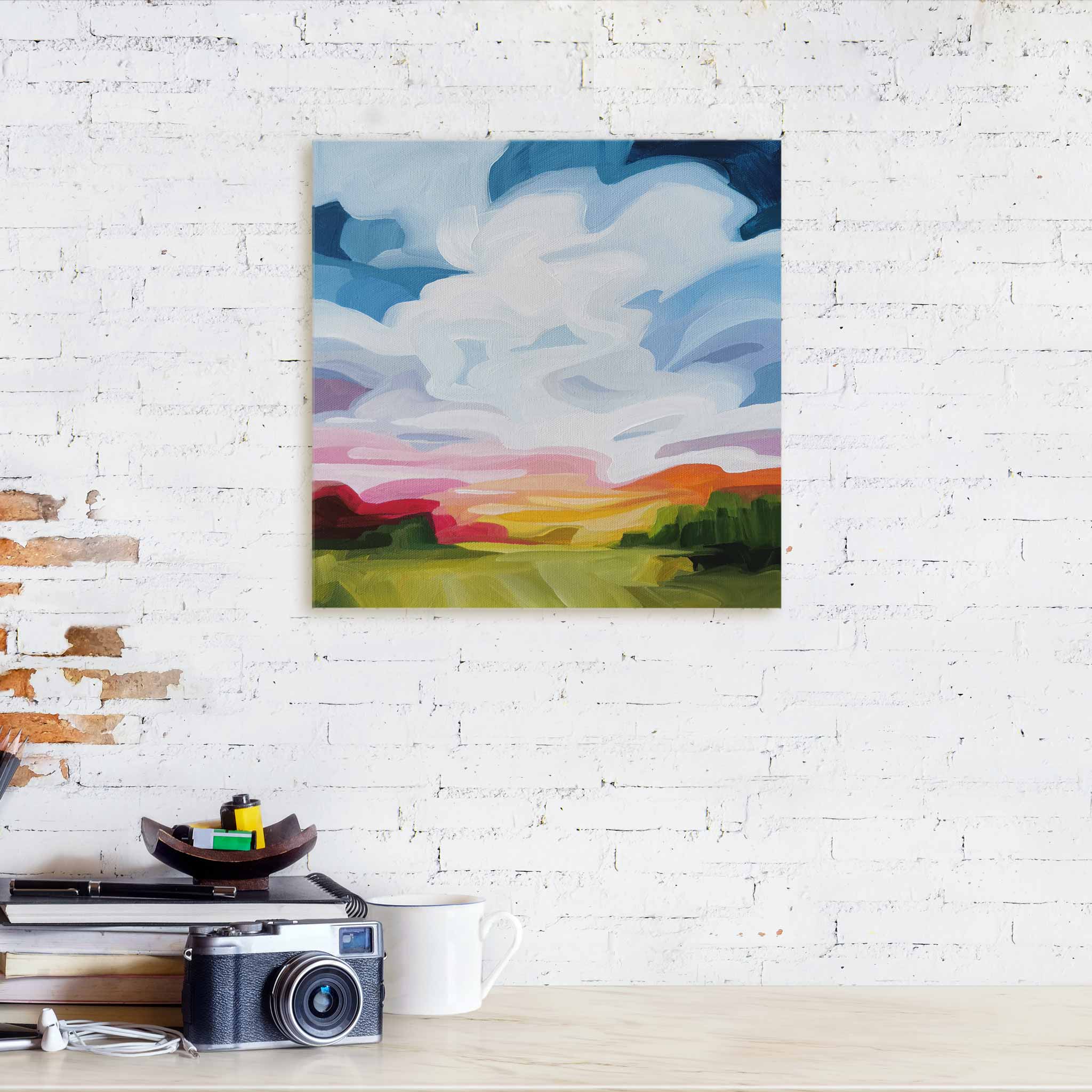
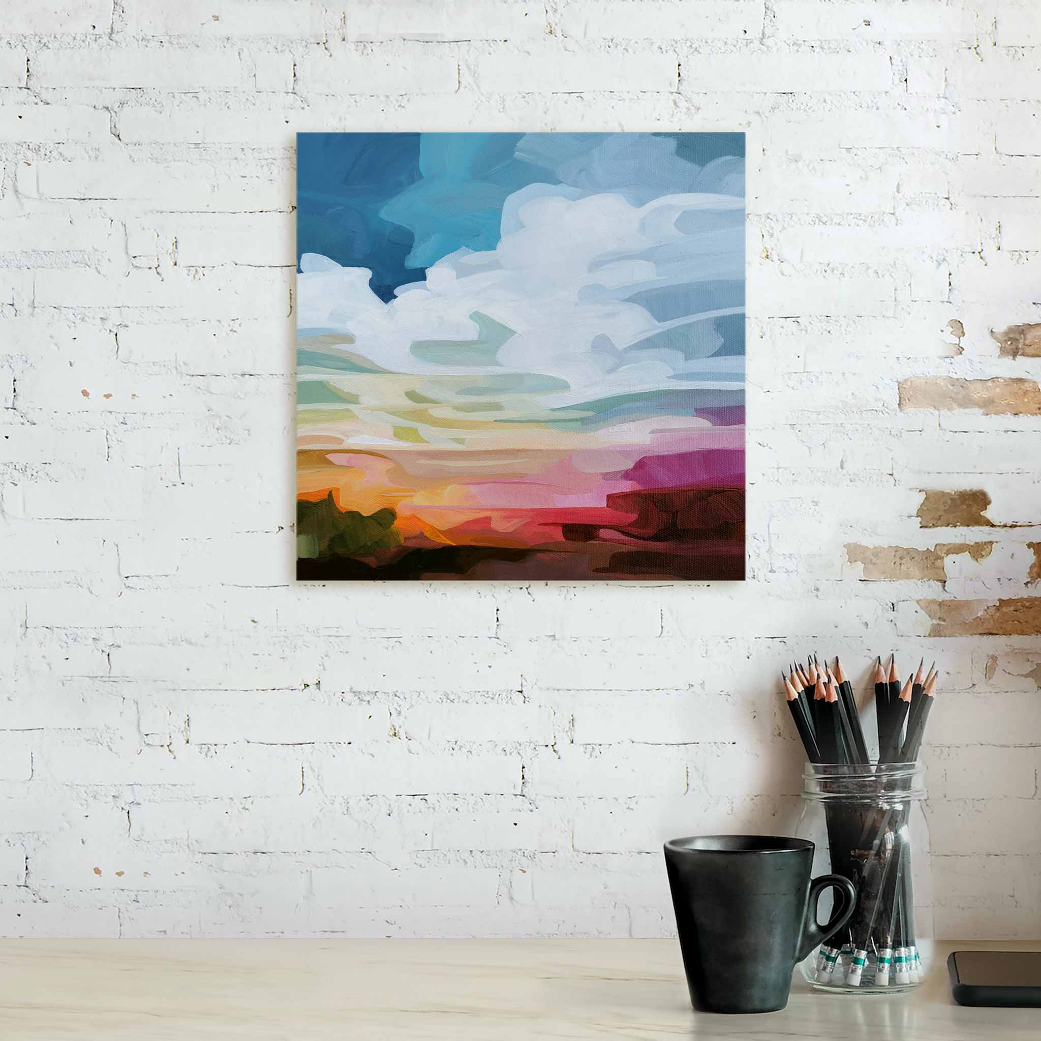
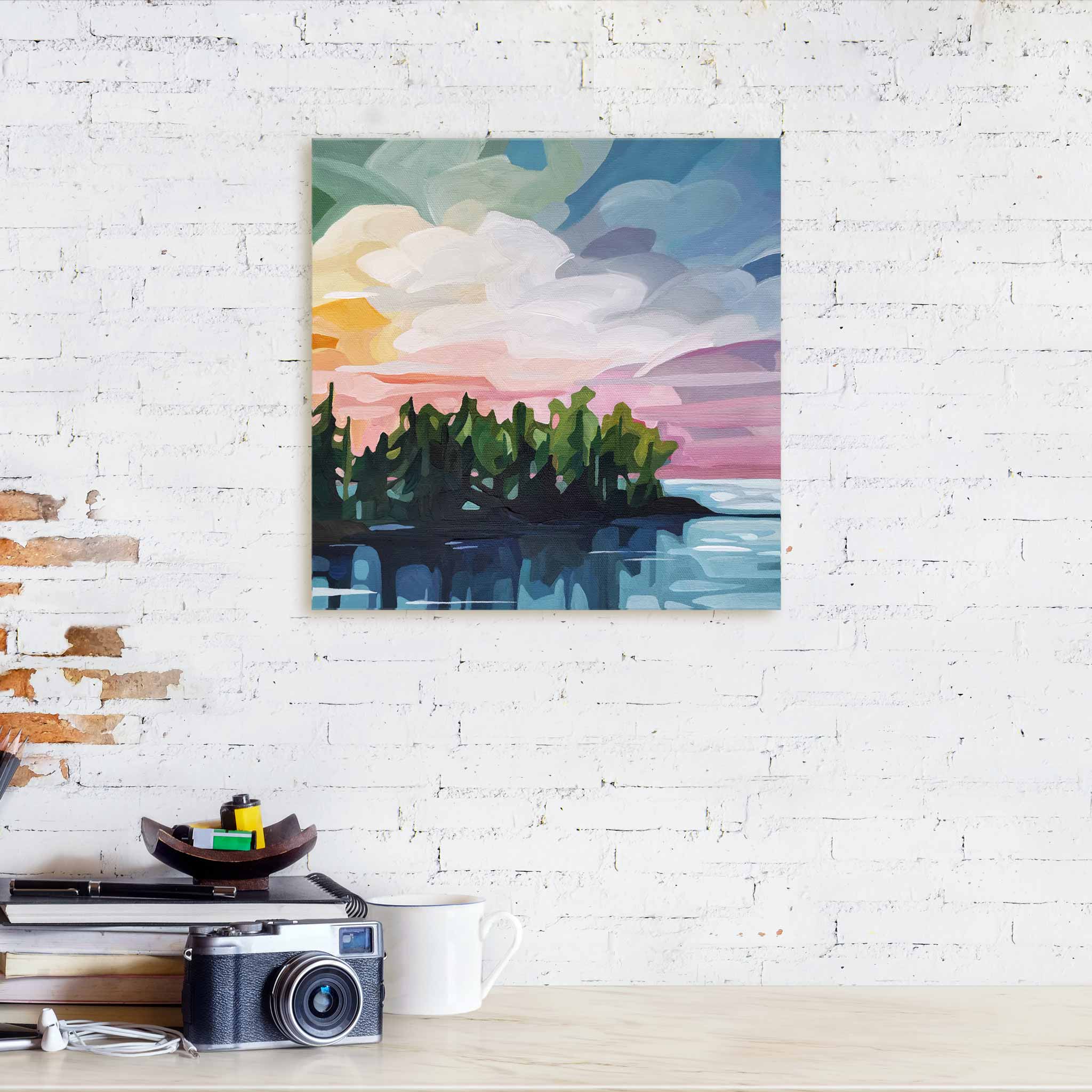
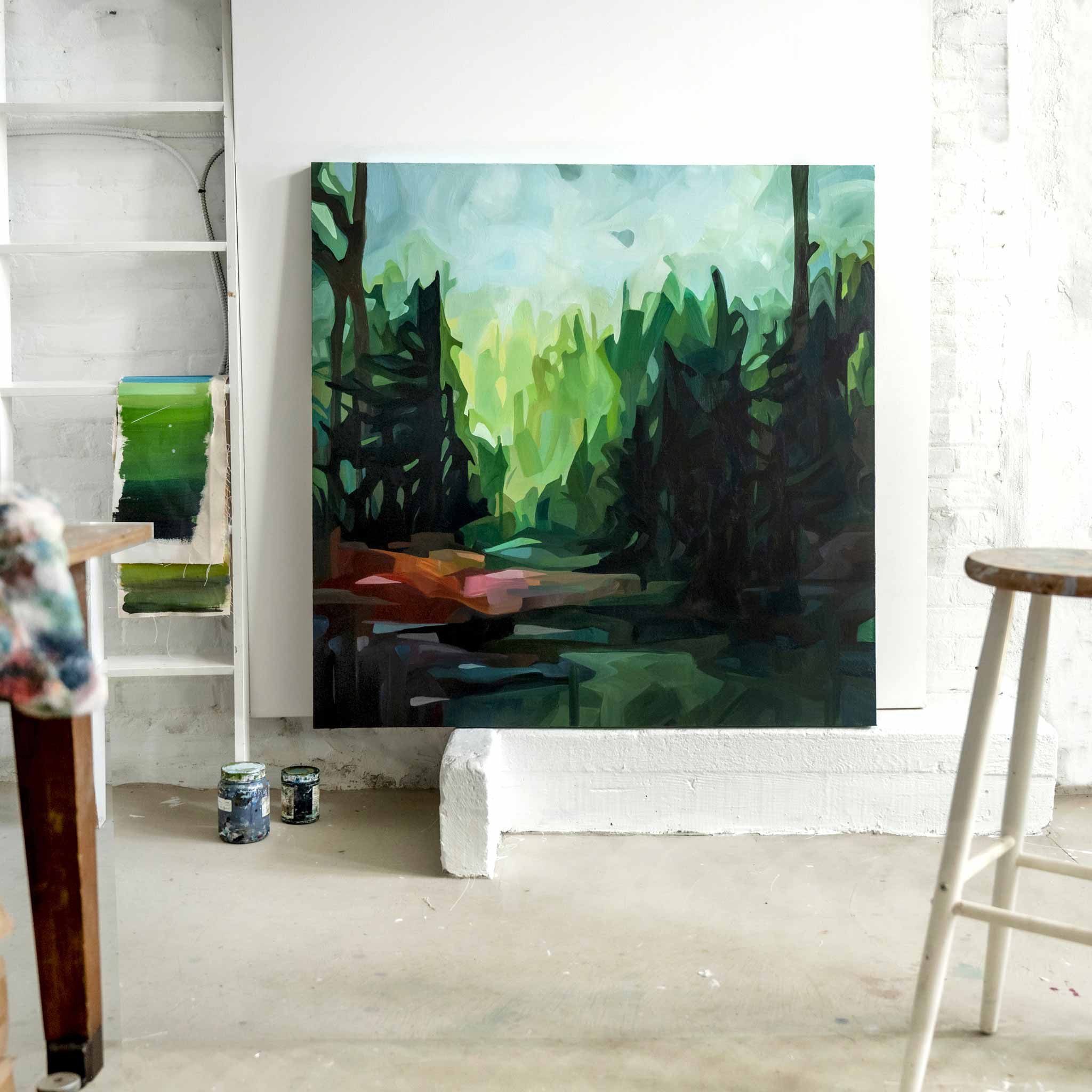
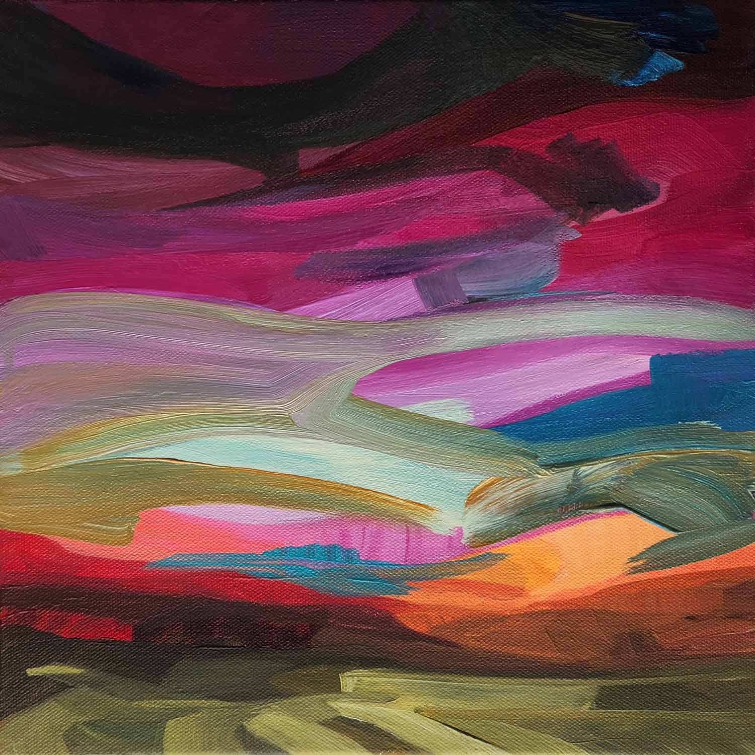
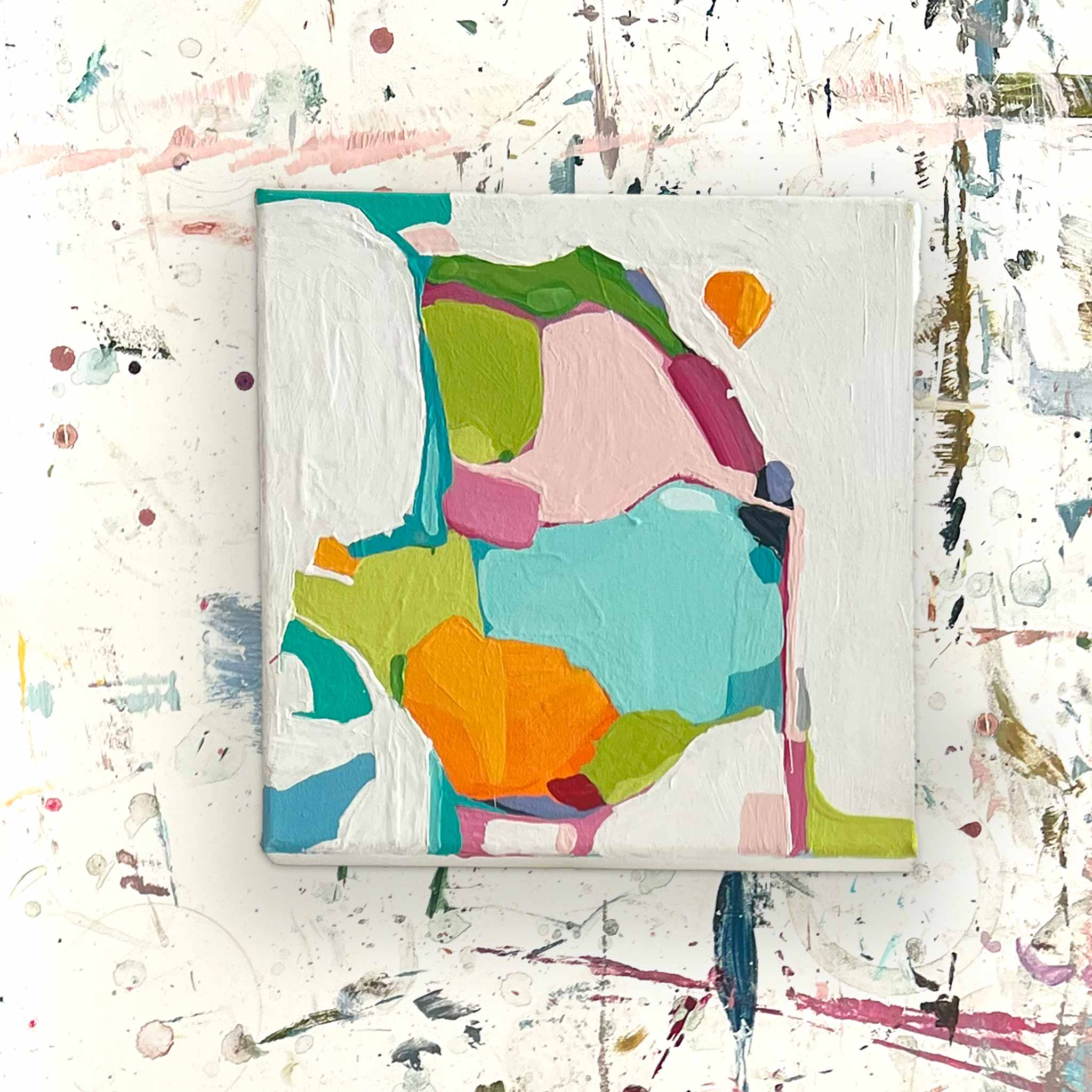
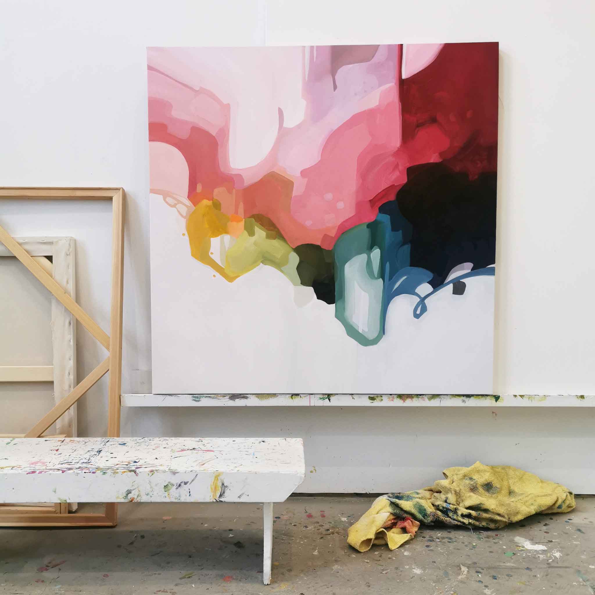
Of all my work, abstracts are the most ‘me’
I see my true self, flaws and all, in my abstract paintings. The playful, curious, mischievous, weird, imaginative, little ol’ me in every brushstroke. With every splash of colour, my abstract art practice lets me dive headfirst into a world of endless creativity, exploration and experimentation. Abstract painting is a journey guided by curiosity, wonder, and a willingness to embrace the unknown. A daring dance with a perfectly imperfect expression of idea and emotion. While it’s the most challenging and frustrating aspect of my painting practice, it’s also incredibly rewarding, super fun and deeply satisfying (when paintings work out!).

How do you do what you do?
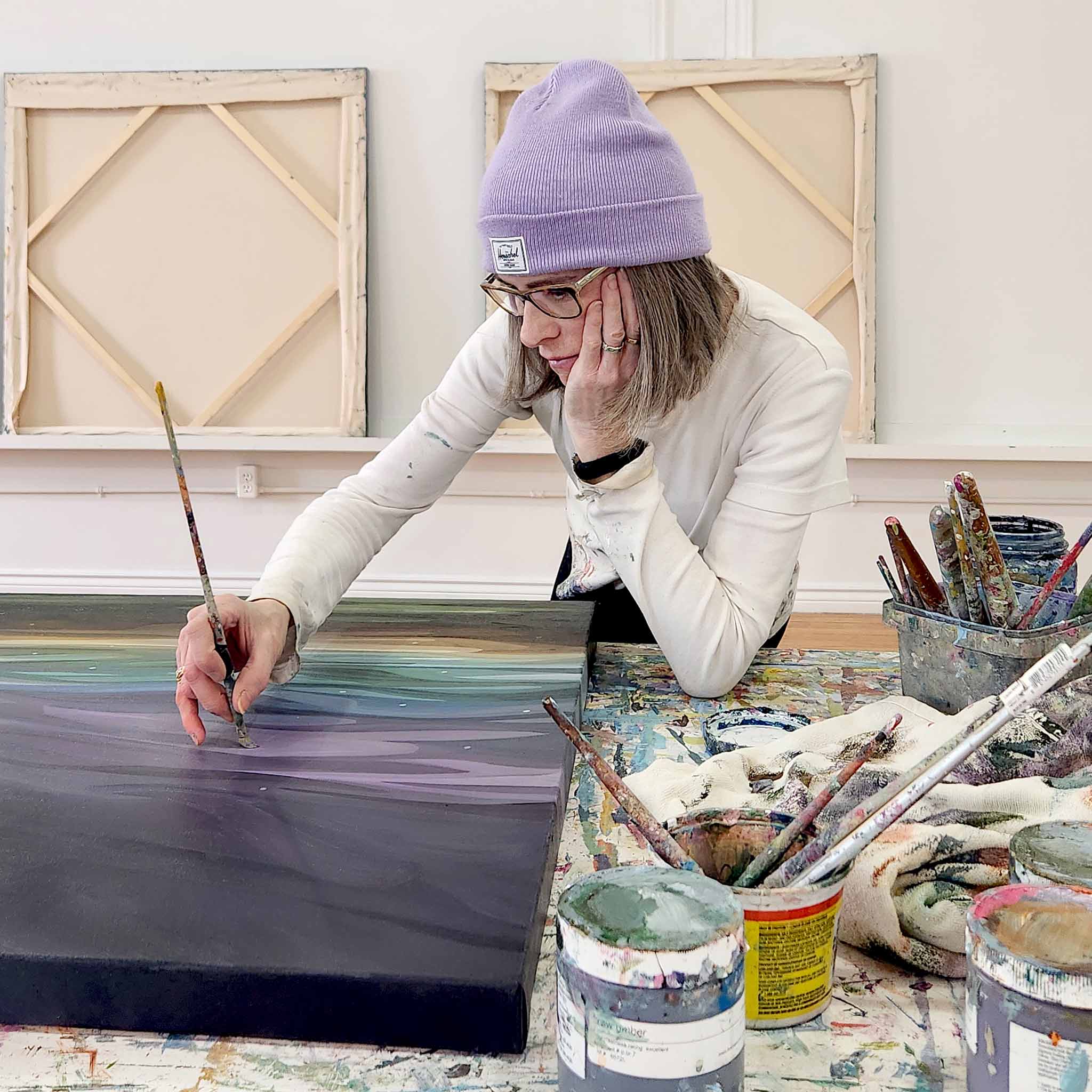
I’m asked about teaching all the time. Begged to run workshops or online courses to demonstrate techniques and explain how to paint abstracts. Sorry – no can do. It’s such an internal, intuitive process – a mystery still even to me! – that my only answer tends to be “I just blob paint down and smoosh it around until it pleases me”. Not the most helpful answer, is it?
So, if you’ll bear with me, I’ve done my best to put my process for abstract painting into words.
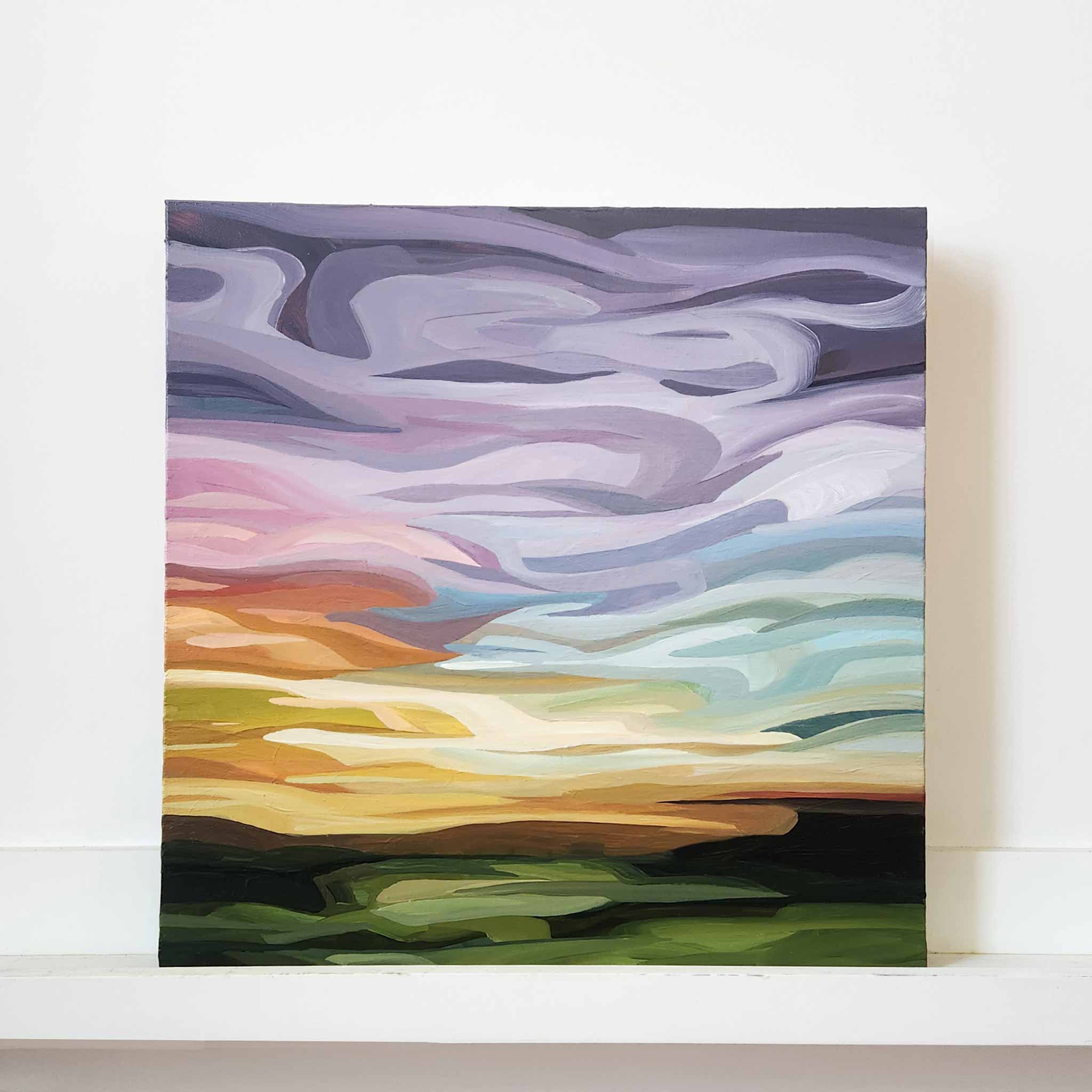
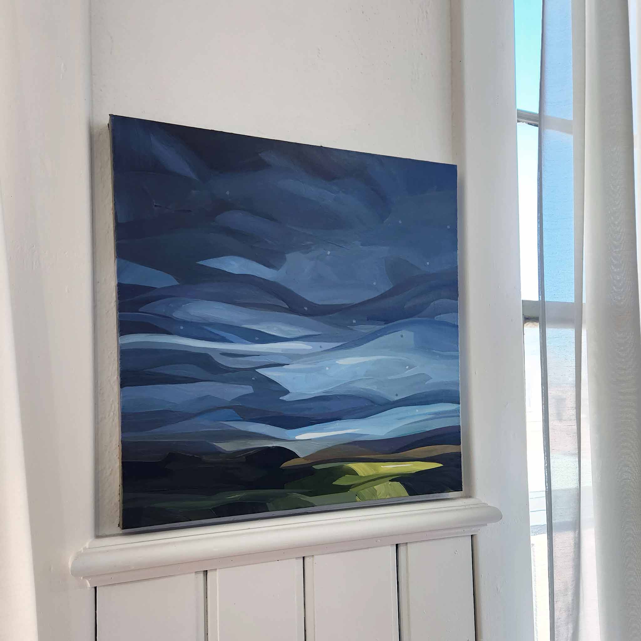
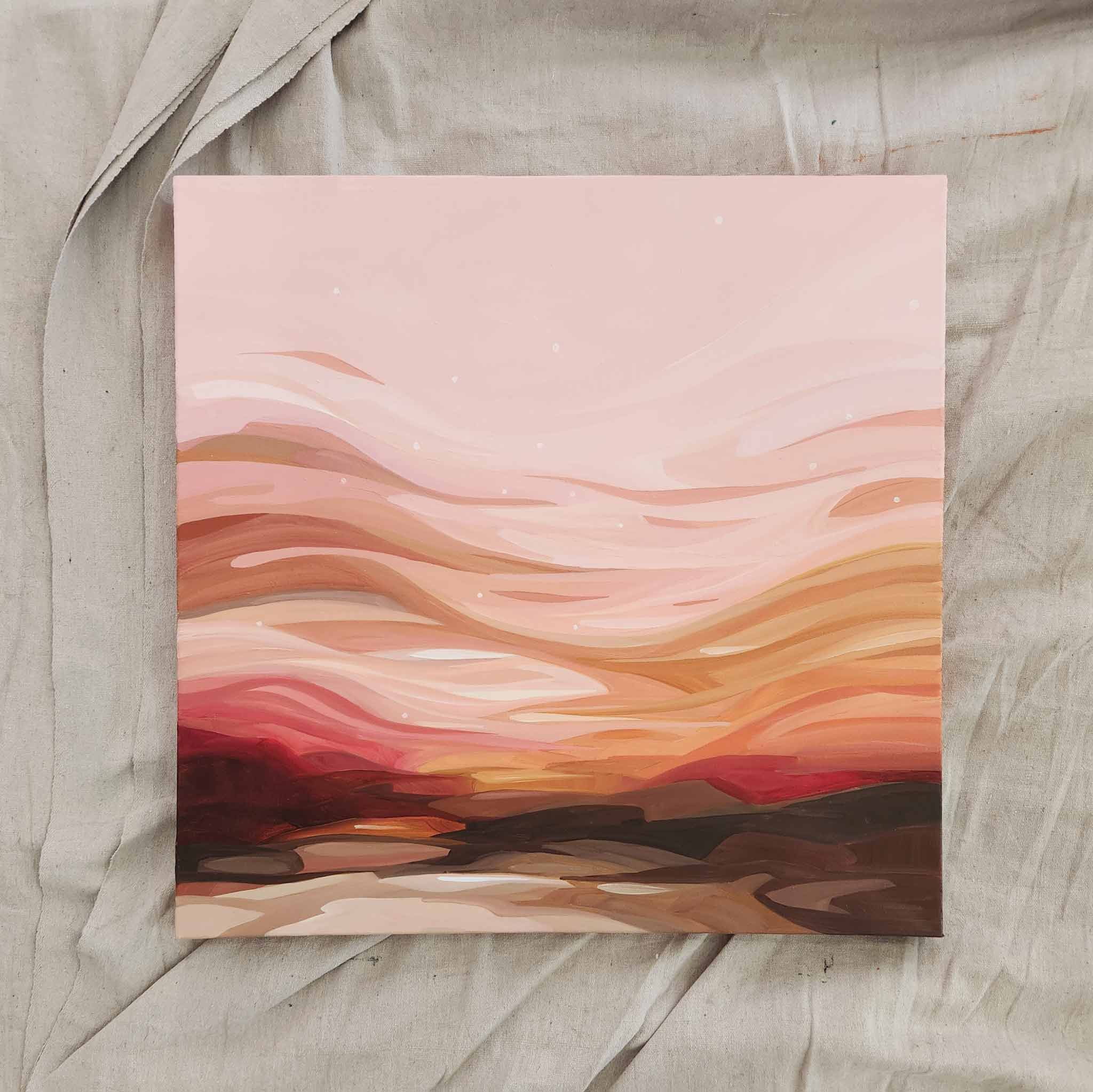
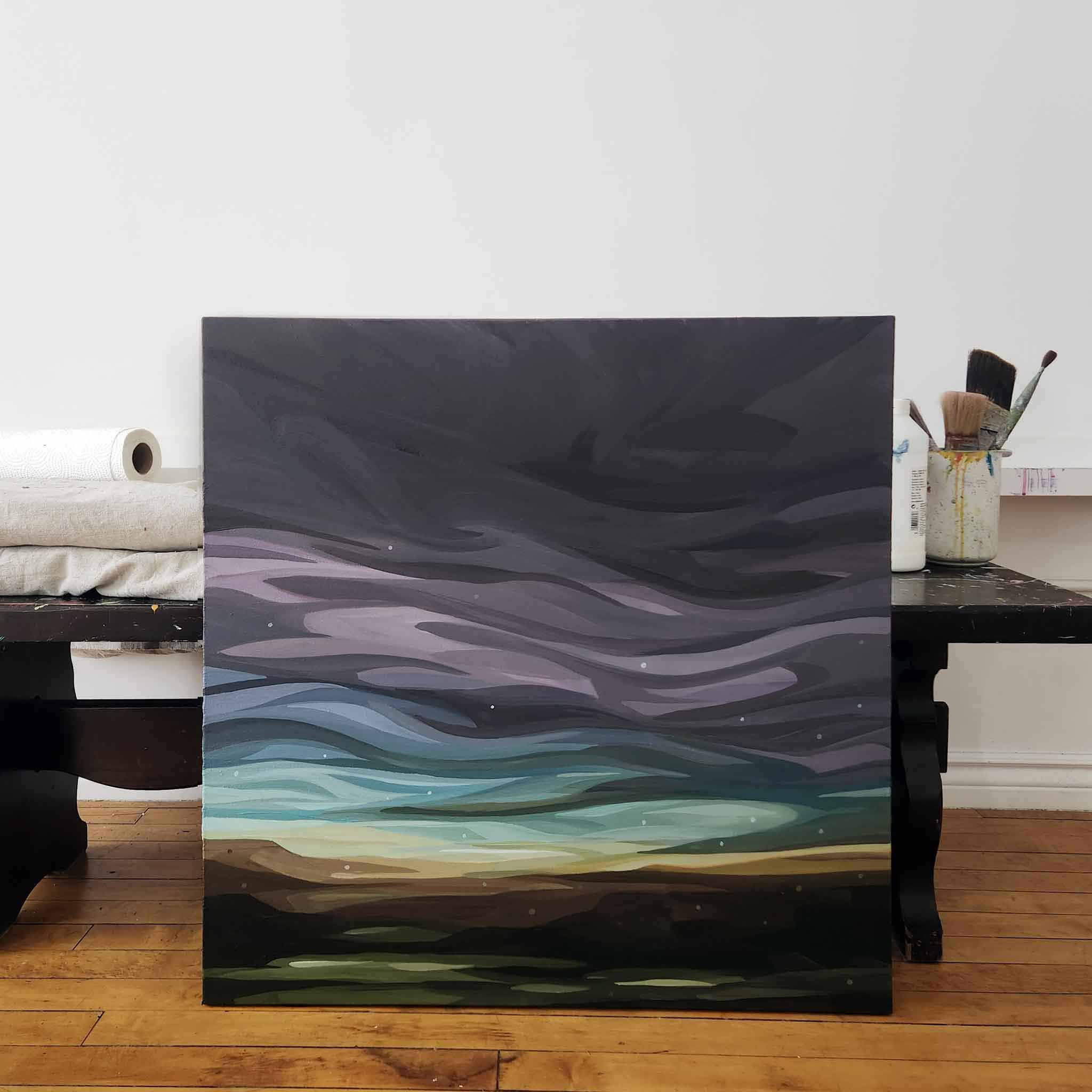
It always starts with colour
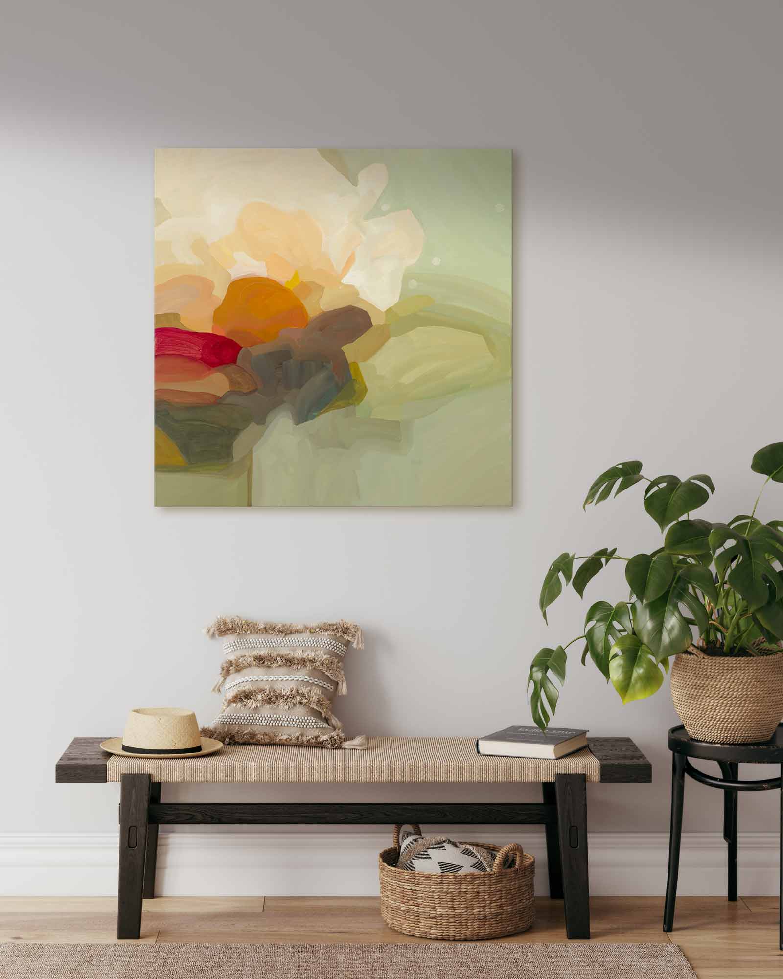
There is no rhyme or reason to my colour palettes other than to say the colours I choose and mix are intimately tied to how I’m feeling in that moment. There are orange days and there are soft blue days. There are days I want to keep white space – to feel the clean, bright openness of “empty” space, and there are days I just need to fill every inch with colour.
I usually have some idea of the colour direction I want to head in, favourite choices and combinations that have become second nature to me after decades and decades of painting. Within those general palettes I like to experiment, mix, blend and place new colours in new ways to see if anything sparks joy. It’s all colour, all play, all day.

The unfolding of "What Ifs"
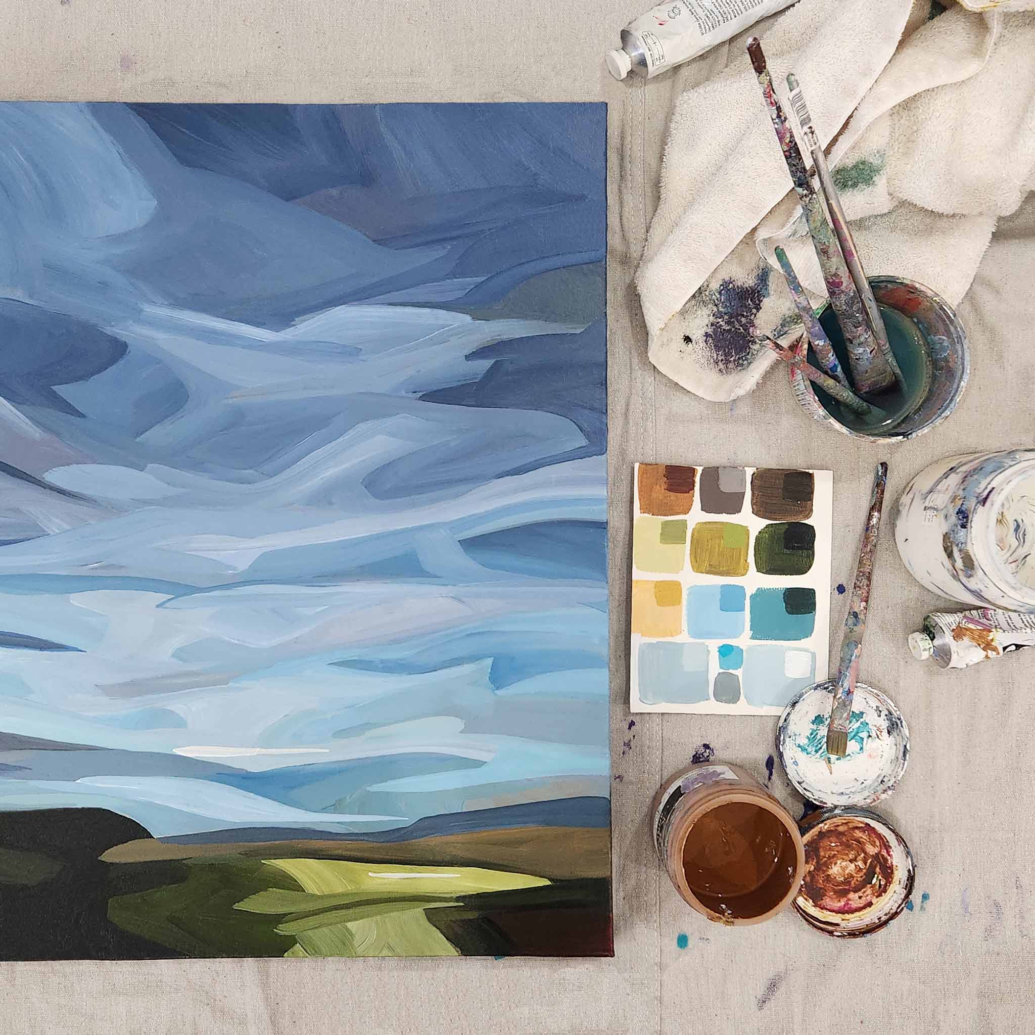
From start to finish, painting (abstract or otherwise), is an ongoing conversation with the canvas, listening to the colours, talking with the brushstrokes and responding to the paint. It’s an endless question and answer. Solving creative problems and choosing and testing options until a painting feels done. It’s never a straight-forward journey – that’s what keeps it so fascinating!
“What happens if....”
“What if I try this …”
“I wonder how this will …”
“What’s not feeling right? What’s distracting my eye? What needs to go?”
“How will this affect that?”
Does it feel special? Is there a sense of magic? Does it make me smile?
When I talk about exploring, these are the types of questions that roll through my head. They’re questions that set the wheels of my creative process in motion, pushing me to explore uncharted territory. What if I try these bold colours together – is it too much? What if I partially mix colours in an unconventional way? Will layers of texture help add interest or distract from the original intent?
I’m not just contemplating colours and shapes; I’m enlivening my spirit, probing the depths of my imagination, reaching into my heart for guidance and the courage to express self through blobs of paint on my canvas.
Embracing uncertainty
Exploration is the essence of the abstract journey and the uncertainties that arise along the way, far from being obstacles, are instead stepping stones that lead me closer to the magic. It's within these moments of ambiguity that I find myself most connected to the rhythm of the artistic process, most challenged by what arises, most alive in the flow of it all
The magic in abstract paintings reveals itself in the space between intention and serendipity. Creating the room for this magic to happen means accepting uncertainty as a companion, quieting my critical voice and embracing the whispers of my heart.
Most importantly, I try to shut down fear – fear of mixing a gross colour, fear of wasting paint, fear of seeing something ugly, fear of messing up whatever good might be happening...and on and on and on. My attitude needs to stay light-hearted and just let curiosity and wonder steer me along the way.
It’s just paint after all, right?!
If I go wrong, it’s an opportunity to problem solve and go right, a chance to test my creativity to find a way through to something beautiful.
Or not, and time to simply start over.
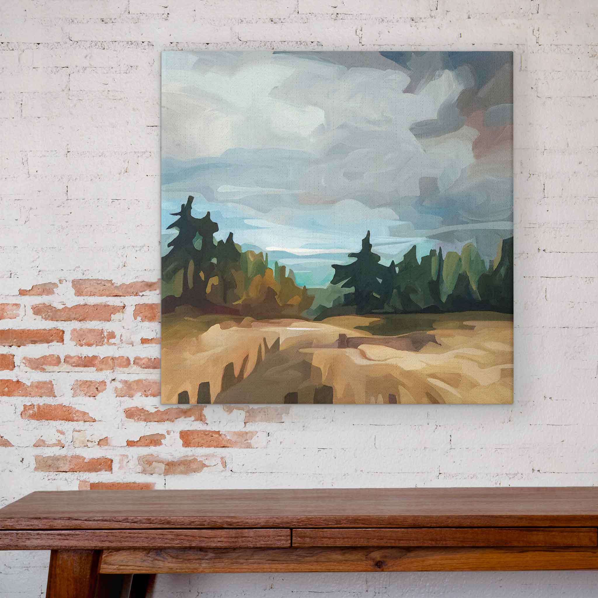
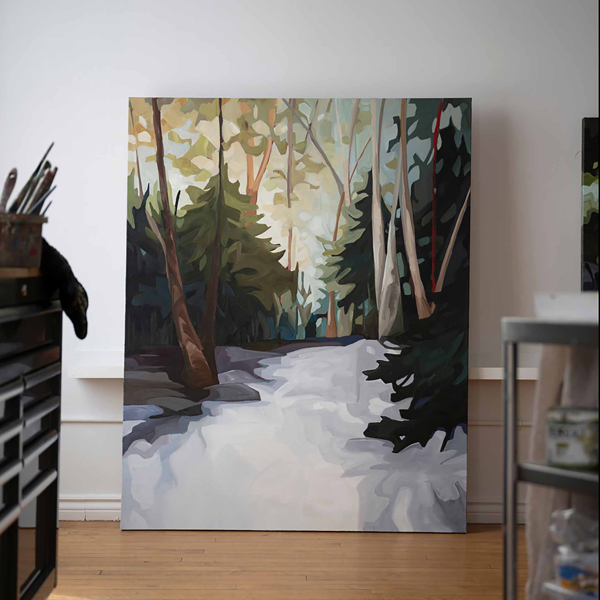
It’s about the journey
When it comes to my abstract work (er, play?) there is no one formula I follow, no shortcuts to success, no rhyme or reason to what I create other than to connect to my innermost self, tap into my playful curiosity and submerge myself in a love for colour. Abstracts aren’t just a creative endeavour; they’re a journey of self-discovery. It's a process that encourages me to shed inhibitions, embrace the unknown, and paint my emotions onto a canvas.
Whether a piece emerges as something spectacular or destined for the dump as a lesson learned, the beauty lies in the journey itself – a journey that is, indeed, worth every splash of colour and every moment of wonder.
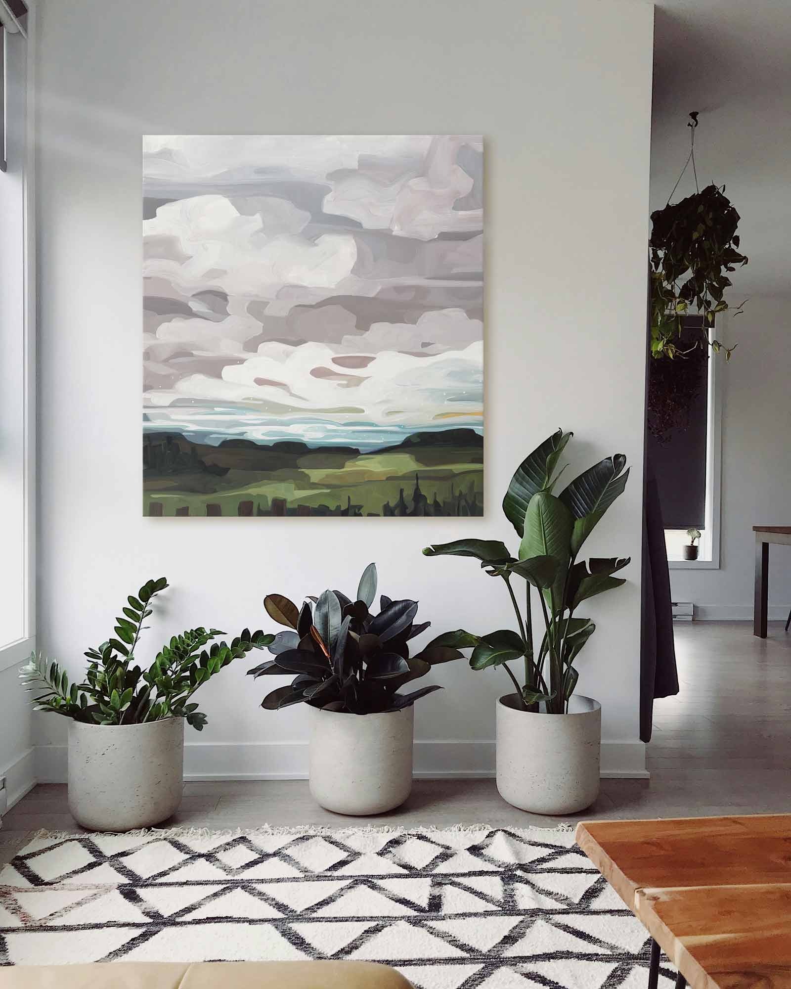
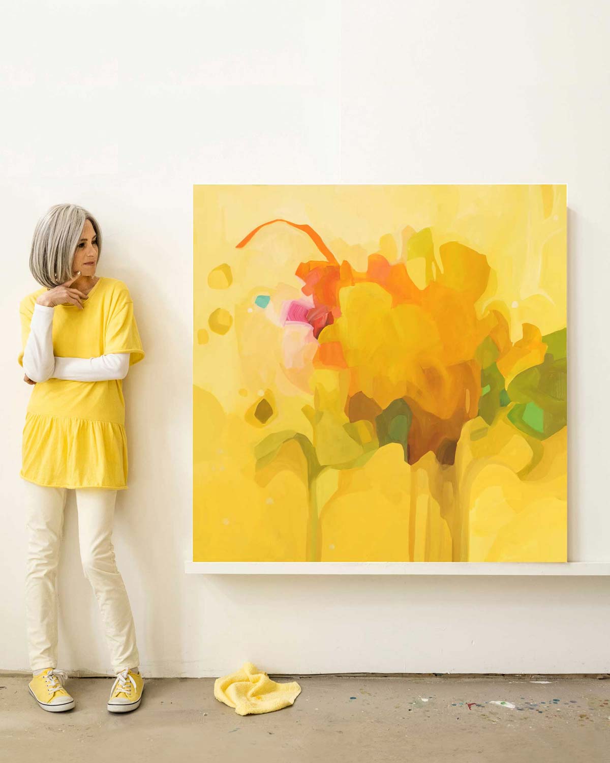
As I write this I’m in the midst of adding the final touches to a new collection of original abstract paintings and art prints. The "Somersault" collection is now available on my shop so if you were hoping to collect and original painting this year, nows your chance! And be sure to follow my abstract life on Instagram @thisbeesme
]]>


 24-04
24-04


 8-08
8-08  8-09
8-09 


 10-01
10-01
 10-03
10-03 10-04
10-04 10-05
10-05 10-06
10-06 10-07
10-07


 24-2
24-2

 12-5
12-5


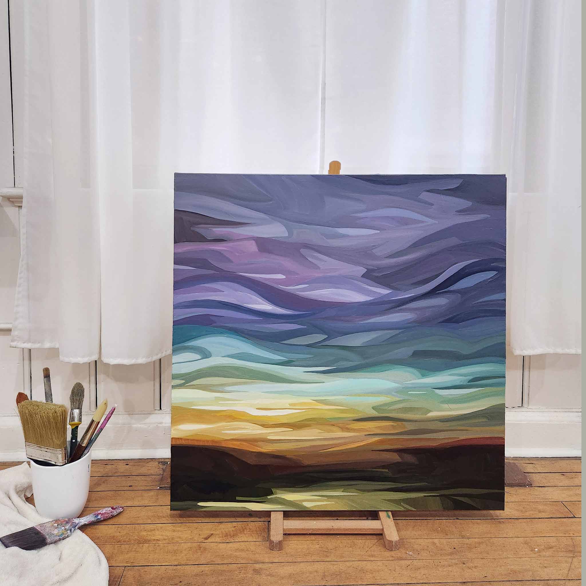
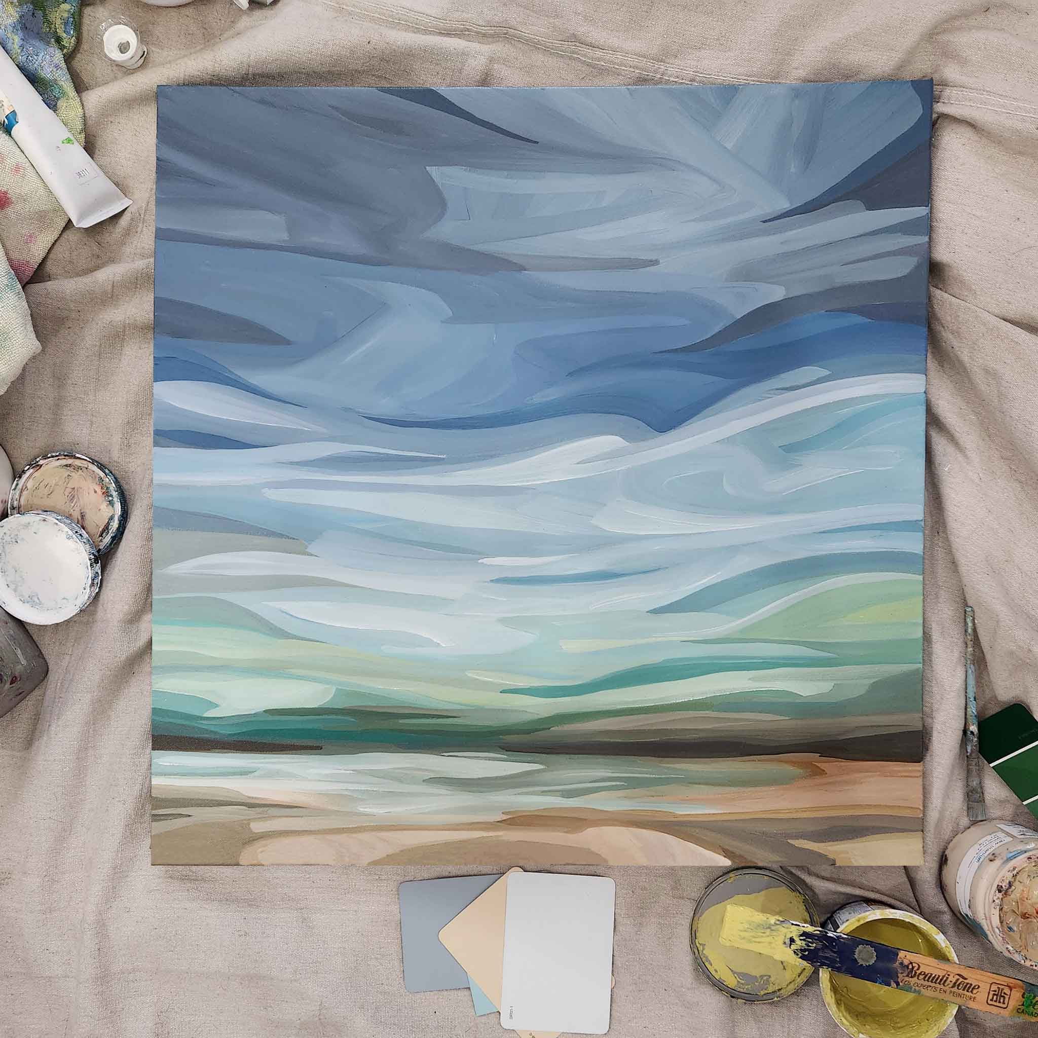
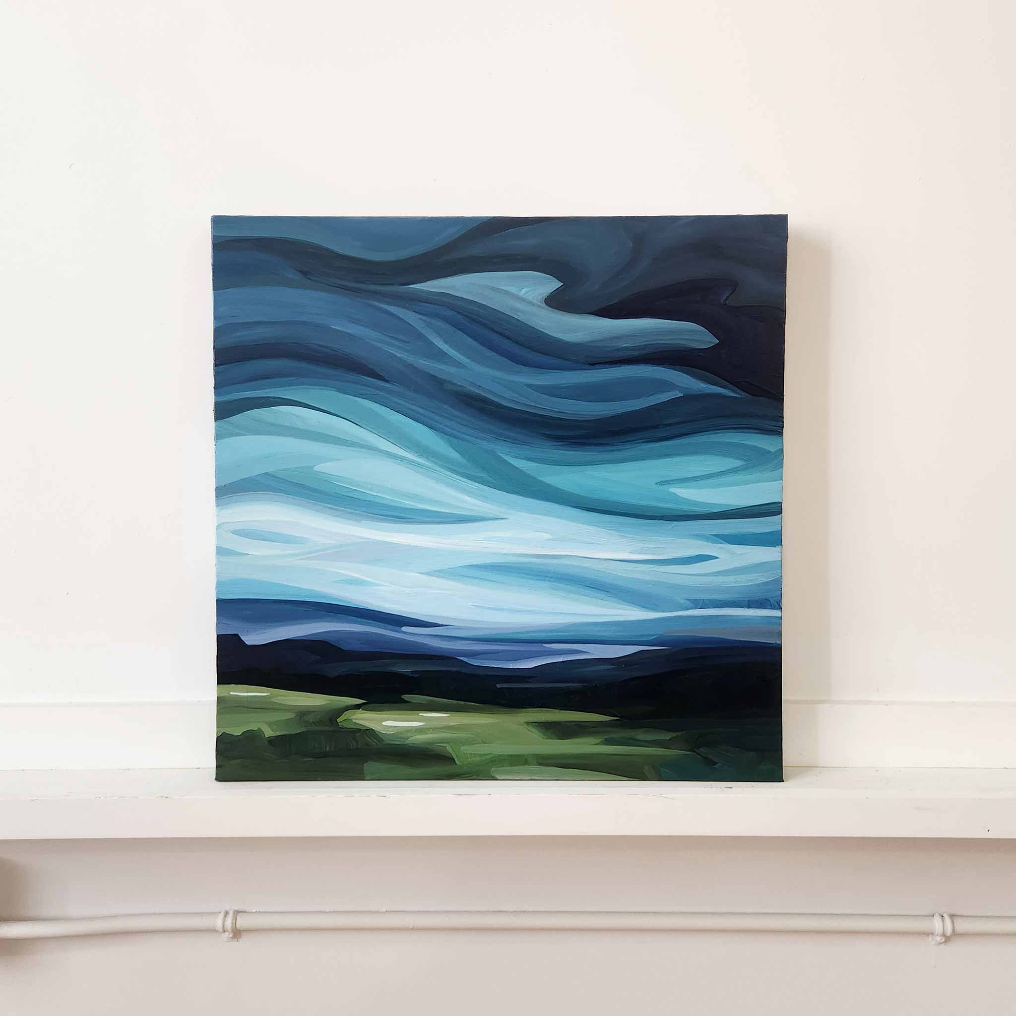
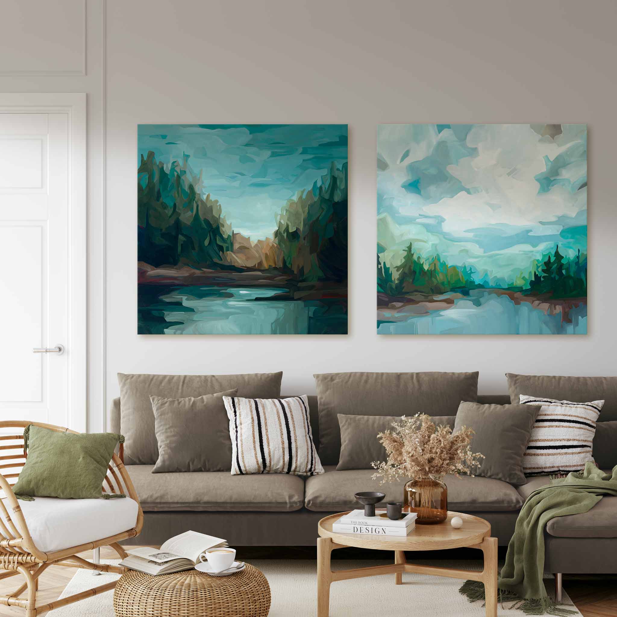
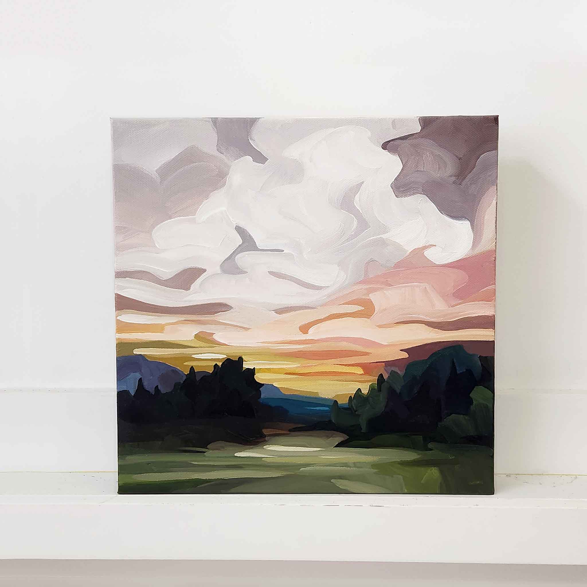
 'Dewpoint' 40" x 40"


 10-1
10-1 10-2
10-2 10-3
10-3 10-4
10-4 10-5
10-5 10-6
10-6 10-7
10-7 10-8
10-8 10-9
10-9 10-10
10-10 10-11
10-11 10-12
10-12 10-13
10-13 10-14
10-14 10-15
10-15 10-16
10-16 10-17
10-17 10-18
10-18 10-19
10-19 10-20
10-20 10-21
10-21 10-22
10-22  10-23
10-23 10-24
10-24 10-25
10-25 10-26
10-26 10-27
10-27