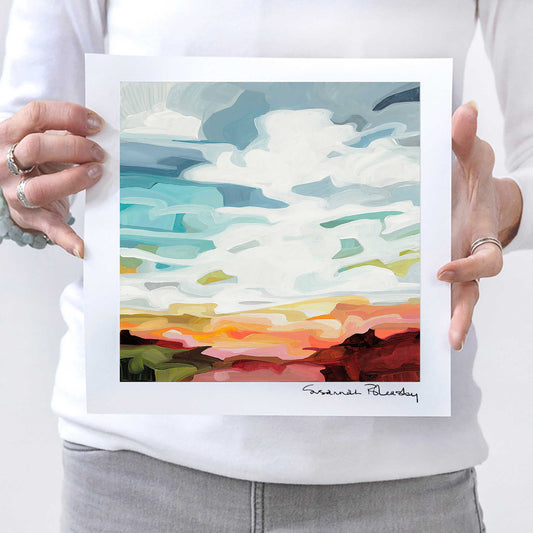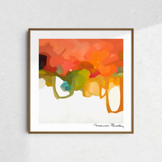
Orange you glad ...
When I was 15 and, in my brief, "too cool for school" phase I bought an orange T-shirt with the words "Look at me Dammit" written across the front. To be clear, I’m not a "look at me" kind of person - not then, and certainly not now (what was I thinking?) but 'lo and behold, it caught the attention of the boy I was crushing on. *sigh* I had discovered the power of attraction – the attraction to colour of course ;) Anyway, we're still great friends to this day; both me and the boy, and me and the orange.
And so began my life-long love affair with this most unconventional colour.

Orange is so much more than the colour of Halloween and safety cones! It's a fabulous zinger of a colour that elevates the energy of a room, begs for attention, and can create interest in a most dynamic and unusual way. It radiates, it glows, it's a playful squeeze of heat that offers no apologies. 'Look at me Dammit' indeed. Look at me!
But it took years for me to develop the confidence, even bravery, to use orange in my work. It's not a colour for the faint of heart. I've spent years growing to love its beautiful intensity, understanding where it fits within my paintings, when to add it in, when to paint it out, and how to use it effectively.
Most importantly, it has taken decades to learn what other colours it's happy to play with within a composition. Its heat can be turned up when paired with pink or cooled down with a touch of teal. The amount of colour, balance, placement, and saturation are all incredibly important when using a colour like orange - it can go from "Oh Wow Yes" to "OMG NO" pretty quickly.
Orange is a fabulous "oh... F*ck it" colour to use when I’m stuck.
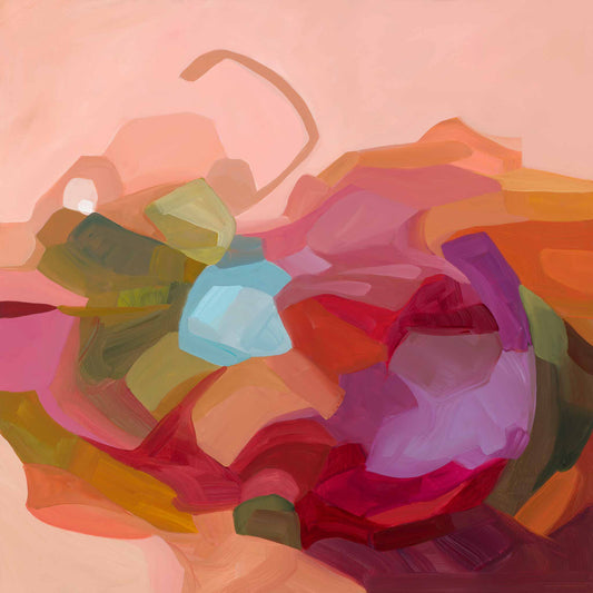
If an abstract painting is sitting in the 'meh' department and lacking the kind of spark I like to see in my work, blobbing on some orange is a sure-fire way to dramatically change the conversation I’m having with the canvas. I can practically feel my pulse increase to match the frequency of the colour and I’m immediately drawn into a daring, exciting new journey.
There's a risk to using orange and it can be a crash and burn exercise - mixing it with other colours can often lead to a muddy mess. But equally, if those blobs land in just the right places, beside other blobs of colour that have landed in just the right places, something phenomenal and completely unexpected could appear. The greater the risk, the greater the reward, right?
 |
 |
Orange needn't be a colour to fear, or be wary of, as so many are. It's here for your enjoyment! It's a super colour and there are lots of ways to incorporate it into your world that add just the right pop of lively fun. I dare you to look at it differently.
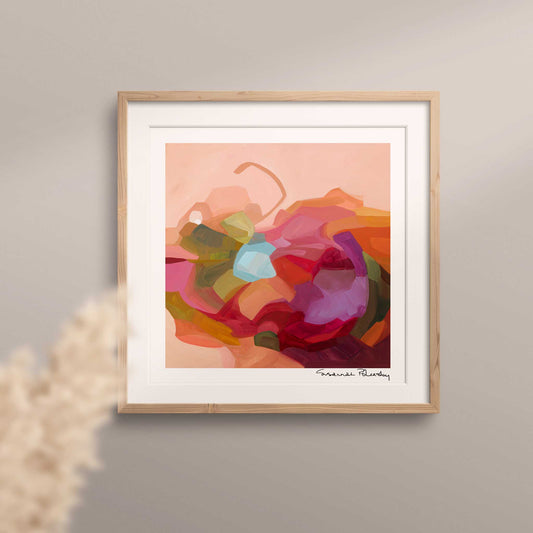
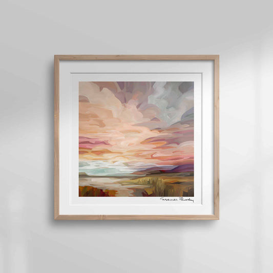
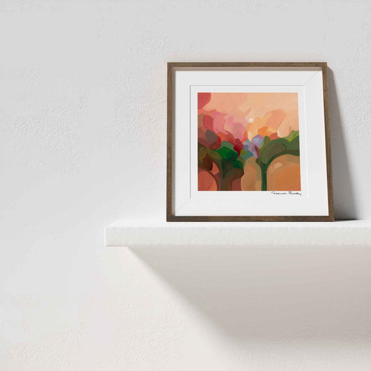
Welcoming a piece of orange wall art into your home - even just something little - shows personality, an elevated appreciation for colour and says something about you as an individual in the best possible way. I promise you; orange is the opposite of just a safety beacon - it can be sophisticated and unusual and wonderfully, unexpectedly, beautiful. There's really nothing like it.

